A mile from the big box
REI arrived in Durango in 2024. On the axes national chains are built for, breadth, price, shipping, an independent shop loses before the race starts. And most small retail sites make exactly that mistake: they imitate big box e commerce with a fraction of the catalog, which quietly concedes the whole game on the competitor's terms.
But Pine Needle holds assets no chain can replicate. Staff who climb and ski the terrain they sell gear for. Same day repair. Rentals. A calendar of local events. The redesign question was never "how do we look as polished as REI's app." It was "what can this store's app do that theirs structurally cannot?"
Sell what only this shop stocks
Every feature proposal got filtered through one question: could REI's app render this? If yes, keep it lean and competent, table stakes. If no, lead with it. What survives the filter is specific: named staff and their picks, live local conditions, community events with local organizations, services, and rentals.
The research ran in three passes: comparative and competitive analysis to map exactly where the big box wins, tree testing to shape and validate the IA before high fidelity, and usability testing on the final flows. Four structural decisions came out of it, and they define the product:
Shop first, community woven through
Commerce owns the nav. Community appears as touchpoints inside shopping surfaces, staff picks, event cards, "ask Sam", not as a destination tab. Tree testing validated the structure before any screens existed.
Photo grid of activities
The landing is built around a photographic activity grid: Climbing, Skiing, Camping, Hiking. Outdoor people identify by activity, "I climb", not by product taxonomy.
Product type chips only
Category screens filter by product type: shoes, harnesses, ropes, helmets. Honest to the shop's actual product data.
Informational, not transactional
Rental fulfillment happens at the counter, fitting, condition checks, waivers. The app's job is to answer what's available and what it costs, then get you in the door informed.
The strategy in one scroll
Every block earns its place by being local
The full home screen, top to bottom. Almost nothing here could appear in a national chain's app without becoming generic, and that's the point.

The grid ends with a person
Category: honest chips, then Sam
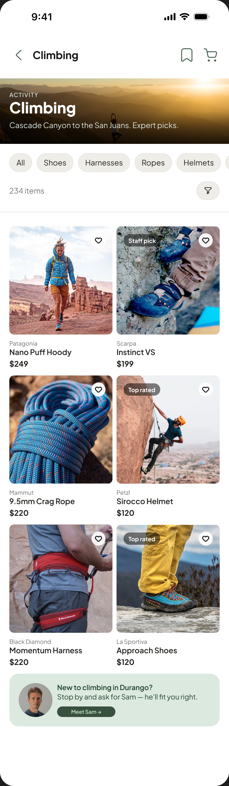
The climbing category leads with place, "Cascade Canyon to the San Juans", filters by product type only, and closes with the shop's real advantage: "New to climbing in Durango? Stop by and ask for Sam. He'll fit you right." The last card in the grid is a person, not a promo.
Product: shop knowledge at the decision point
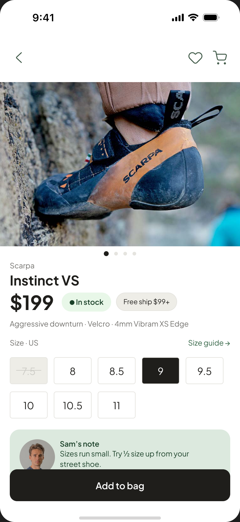
The product page is deliberately conventional, gallery, price, stock, sizes, because conventions convert. The one addition is the shop's voice exactly where doubt lives: "Sam's note: sizes run small. Try half a size up from your street shoe." That sentence is inventory REI doesn't carry.
Honest scope, honest next steps
Seven hi fi screens covering the core loop: land, browse an activity, evaluate a product, check out, get confirmation, plus search, filters, and the nav drawer. The IA and the four structural calls above are the real deliverable; the screens are their proof.
The redesign was measured, not just drawn. In usability testing, task scores moved from 1 of 5 on the existing experience to 4.5 of 5 on the redesign. This is still unsolicited work, so the honest next step needs the shop itself: validating the activity grid against real browse patterns and working out the rentals content model with the people who run the counter.